Problem
Consumers don't trust chatbots
From customer and end user conversations, we learned (and personally felt strongly) about the negative stigma surrounding chatbots because they…
Often deliver unsatisfying experiences
Can be time consuming
Feel dated and distracting when interacting with sites
Lack of empathy and understanding
Our specific goal
To design an alternate experience customer service experience that is more trustworthy and efficient
Research
We engaged in interviews with both Pypestream customers and end users
More specifically, we wanted to know how often people use chatbots, what they use them for, how they feel about chatbots, whether their issues get resolved, and if they have any frustrations with them.
Identified pain points
From Pypestream customers (enterprise companies)
High drop-off rates
Increased stigma around chatbots
Lack of customization and branding
From end users (anyone that would engage with a chatbot)
Frustration around longer conversation times
Inability to get answers to simple questions
Excessive back and forth conversation
Key realizations
People expect chat interactions to highly resemble human conversations.
Hence, they are often disappointed.
The bottom right-hand corner is cursed.
Too much stigma! Most users instinctually just ignore chatbots or popups from the bottom right.
Back and forth conversations are not always necessary.
Makes it super inefficient and frustrating for a user
design explorations
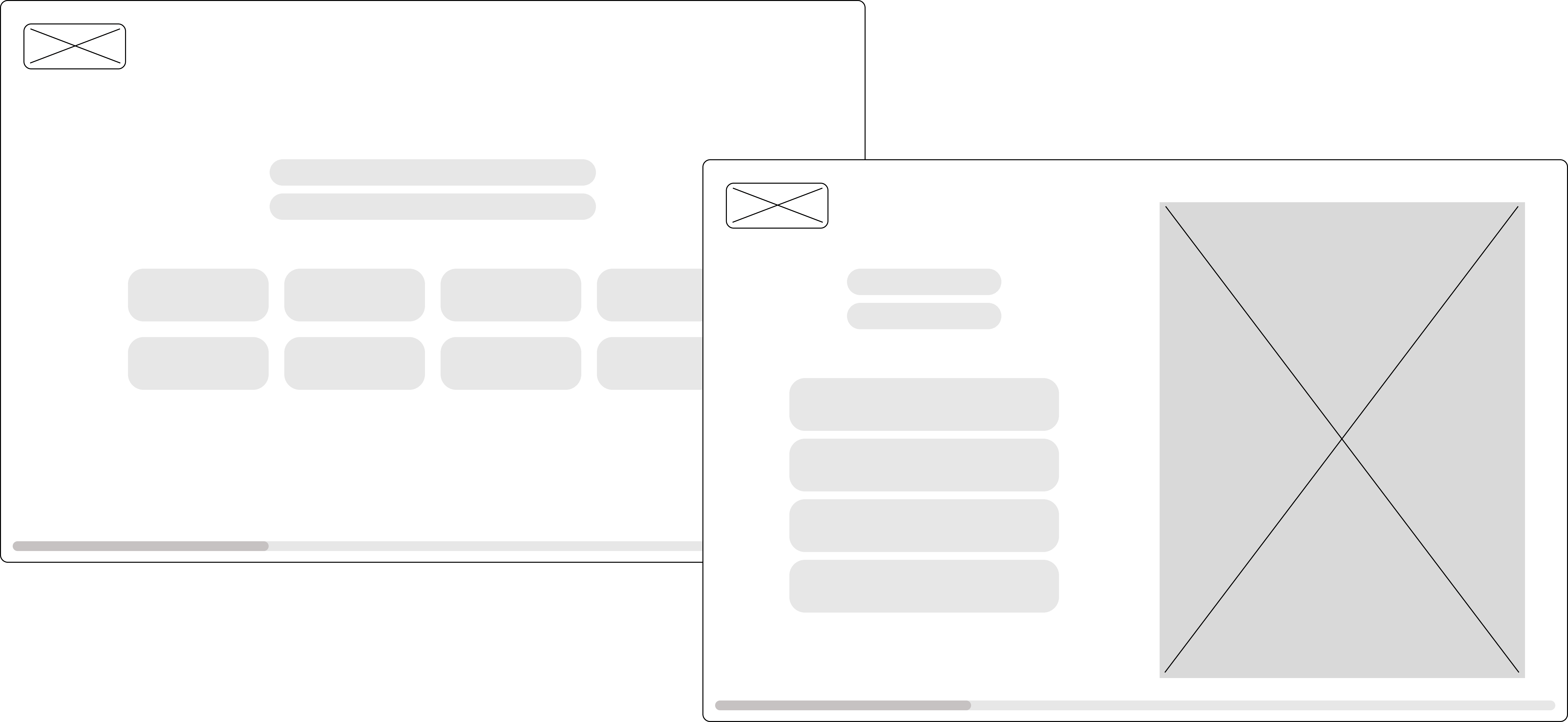
Wireframing
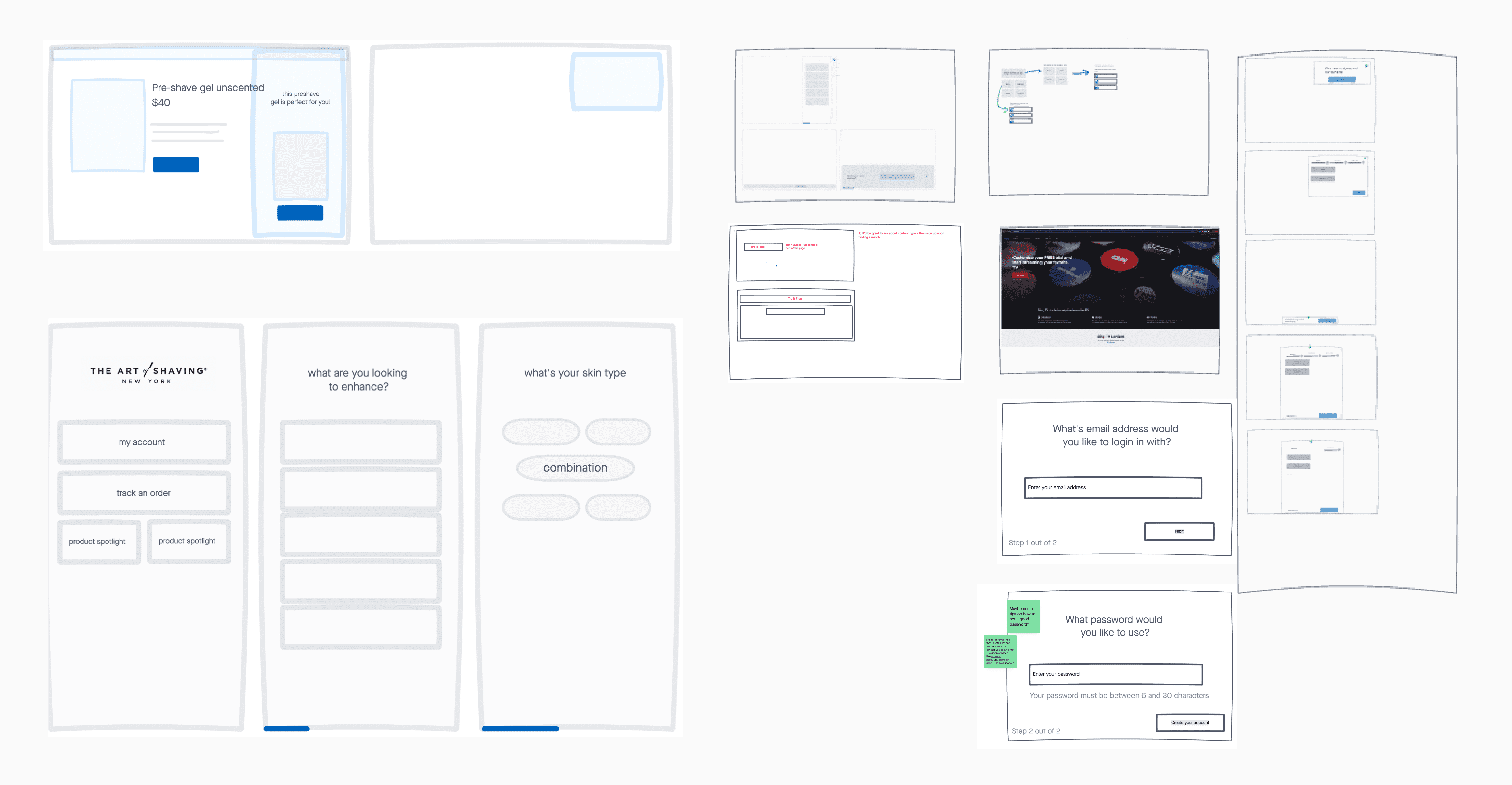
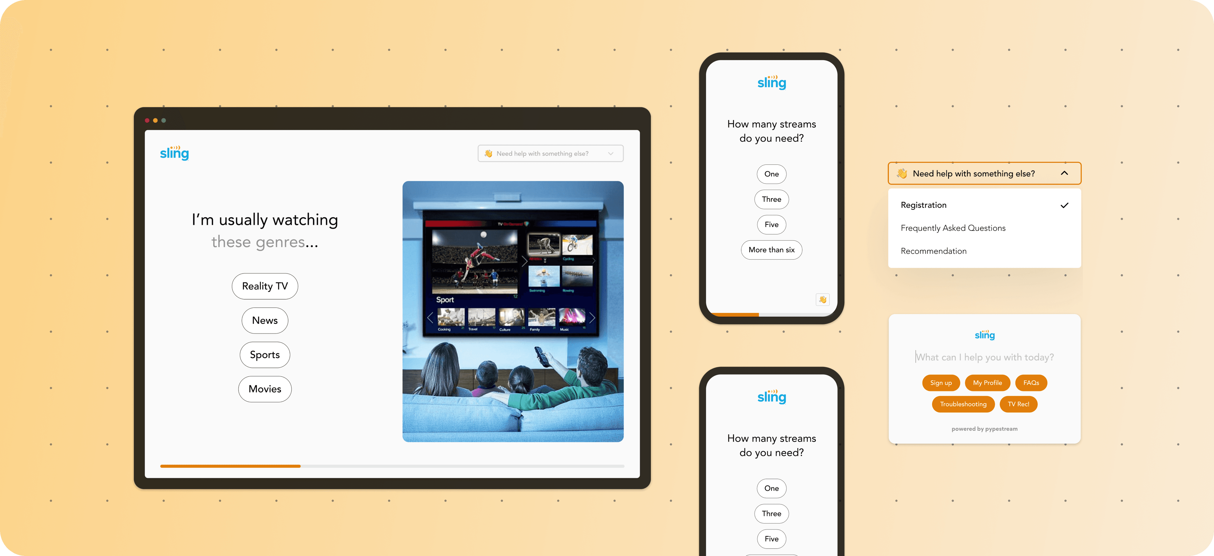
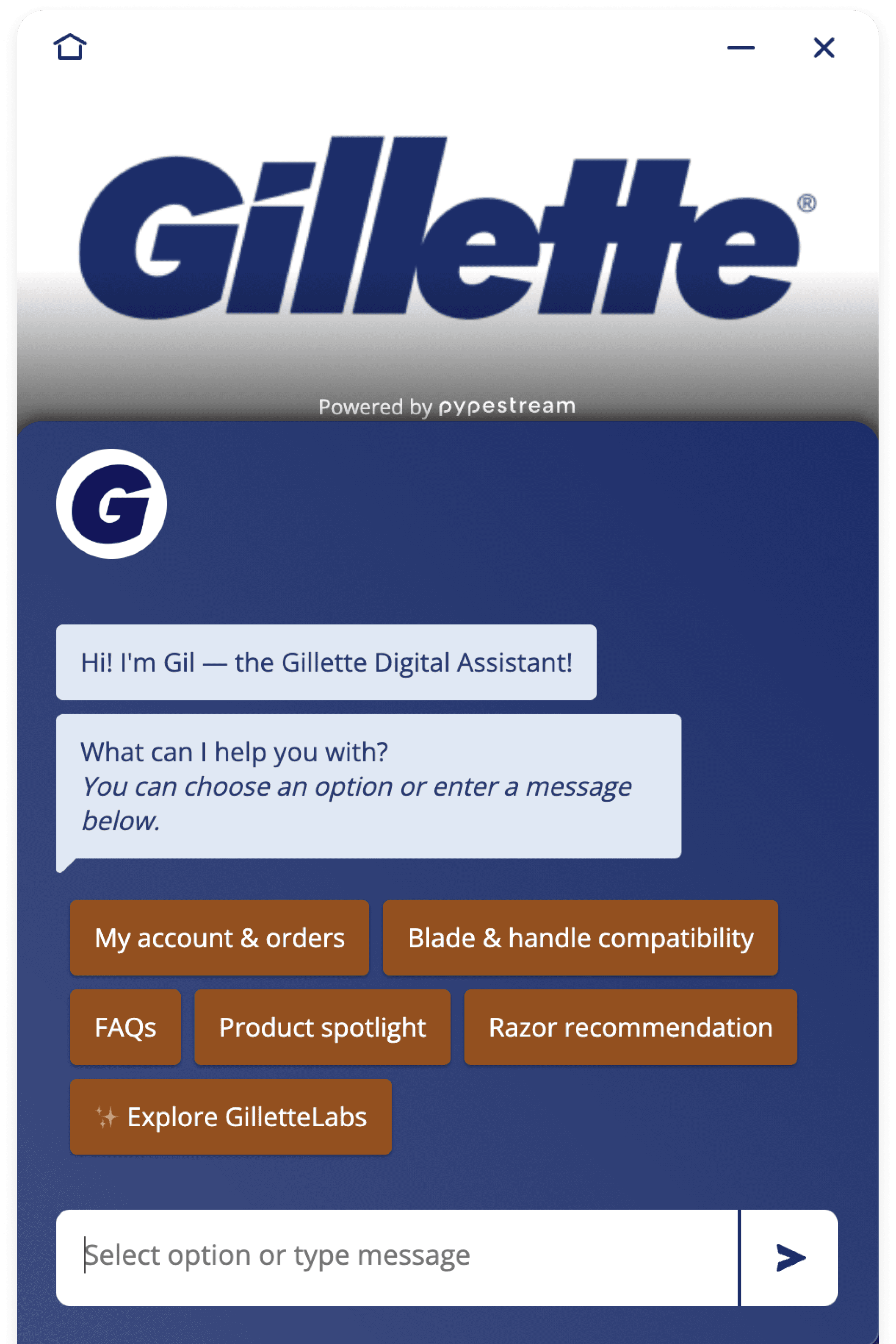
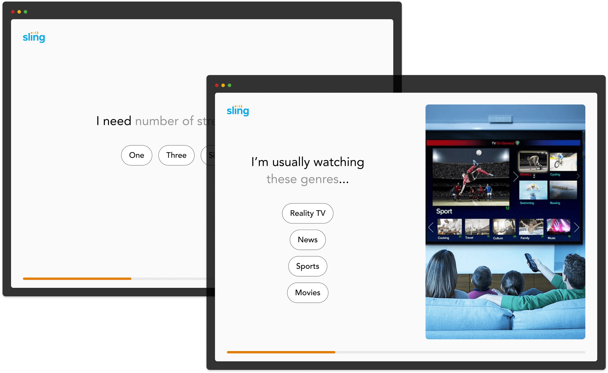
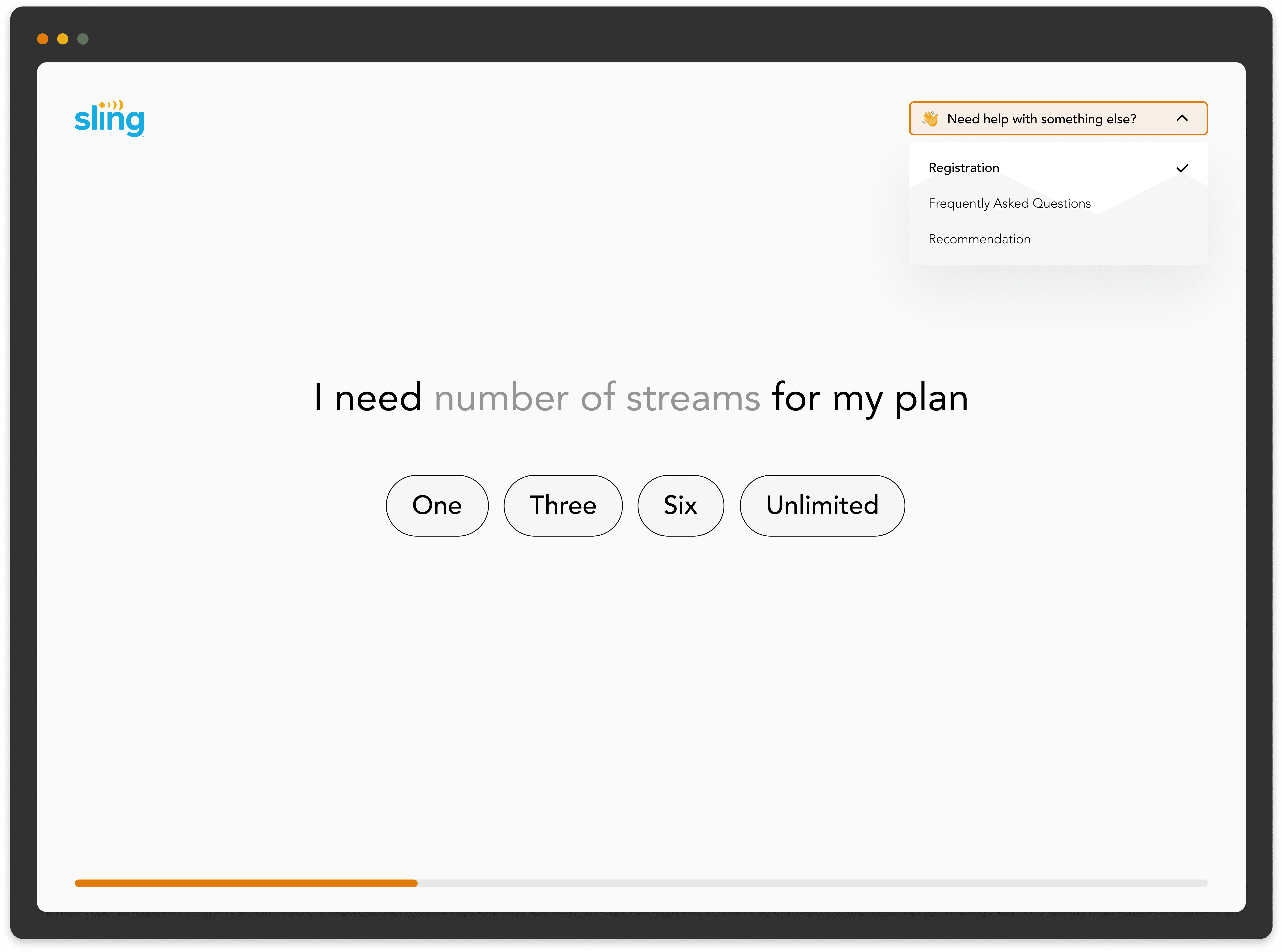
After having more internal discussions, we decided to prioritize these features for the POC:
Progress indicator: for transparency regarding length of this experience
Full-screen layout: 100% attention from user, feels more modern and simple
Auto-complete text fields: more efficient for user
Simple quiz-like format: reduces waiting time
Logos and customizable color schemes: to create more engaging, customizable experience
Testing
For testing, we created a prototype based on an existing chatbot flow around registration. This way we could validate efficiency by measuring time saved. The results showed users saved an average of 4-5 min per flow, cutting the total time down by almost 40%.
We also received much candid feedback around comparison between the two experiences.
“It looks authentic, it looks professional, it looks like an extension of the websites.”
- Vice President at Western Dental
“I love it. I love the simplicity, it makes me think I won’t have to do so much work here. I love big screen piece.”
- Global Solutions Manager at P&G
“If you need a beta or test microapp we’d love to do that for you. My interest is 5 out of 5, I love it and want it tomorrow.”
- VP Marketing at BerkleyNet
“You’re onto something with full screen.”
- Sr. Director at Uplift
“Love it, I’m already in love”
- Sr. Manager at Sling
Further considerations
How do users enter this full-screen experience?
For linear use-cases like registration, a customer's website typically offers a direct entry point like a 'Sign up' button. Clicking on this button could launch our full-screen experience pretty seamlessly. Additionally, we explored alternative options such as a sticky mini menu or text field on the customer's home page.

How can users navigate between different flows?
While testing, customers expressed the desire for navigation options between different use cases. They wanted to encourage users to explore more resources and prolong their experience with the product.
How can we ensure feature parity with chatbots?
Customers expressed concern for needing the same interactions and elements such as carousels, date pickers, rating scales, etc in this modality. Our challenge was to scale these components and optimize them for this larger modality.
We identified the most used elements to be buttons, carousels, secure entry, document upload/download, and date picker. The design team focused their efforts to redesign these elements, so we could have them ready for our pilot program.

Next steps…
We hope to ramp up usability testing with end-users very soon.
Customer conversations validated the market, but we plan to conduct additional usability testing to ensure the user experience is intuitive and up to par.