Problem
Our interface is challenging for non-technical DIY users to navigate.
Pypestream has traditionally operated as a white-glove service, offering a high-touch and personalized experience to its customers, with dedicated CX teams . However, to scale faster and more efficiently, we recognized the need to shift towards self-serve and DIY platform.
This shift led to product misalignment, as the original UX did not meet the needs of the new target users. Our new users required a more intuitive and user-friendly interface, streamlined processes, and easily accessible resources.
Our specific goal
To design an intuitive, user-friendly interface for both developers and non-technical users, ensuring seamless navigation and efficient product utilization.
Research
User persona development
Held interviews with developers and non-technical users
Hoped to get more insights around the following areas:
Usability and ease of use
How easily can users navigate the interface?
Intuitiveness
Does the interface align with users' mental models and expectations?
Learnability
How quickly can new users learn to use the interface proficiently? What is the task success rate for users building a simple five node solution?
Overall satisfaction score
How do users rate their experience using the interface?
Identified pain points
Solutions feel too large and overwhelming, hard to navigate and find nodes
Editing panel overcrowded with excessive options and numerous fields
Lack of visibility into appearance of elements while building
Interface is outdated, clunky, and slow
Measured stats: Task success rate: <60%; Satisfaction score: <7
design explorations
Layouts
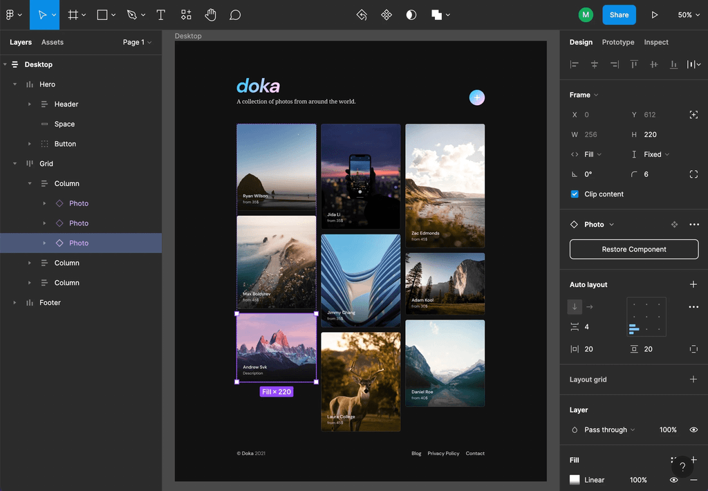
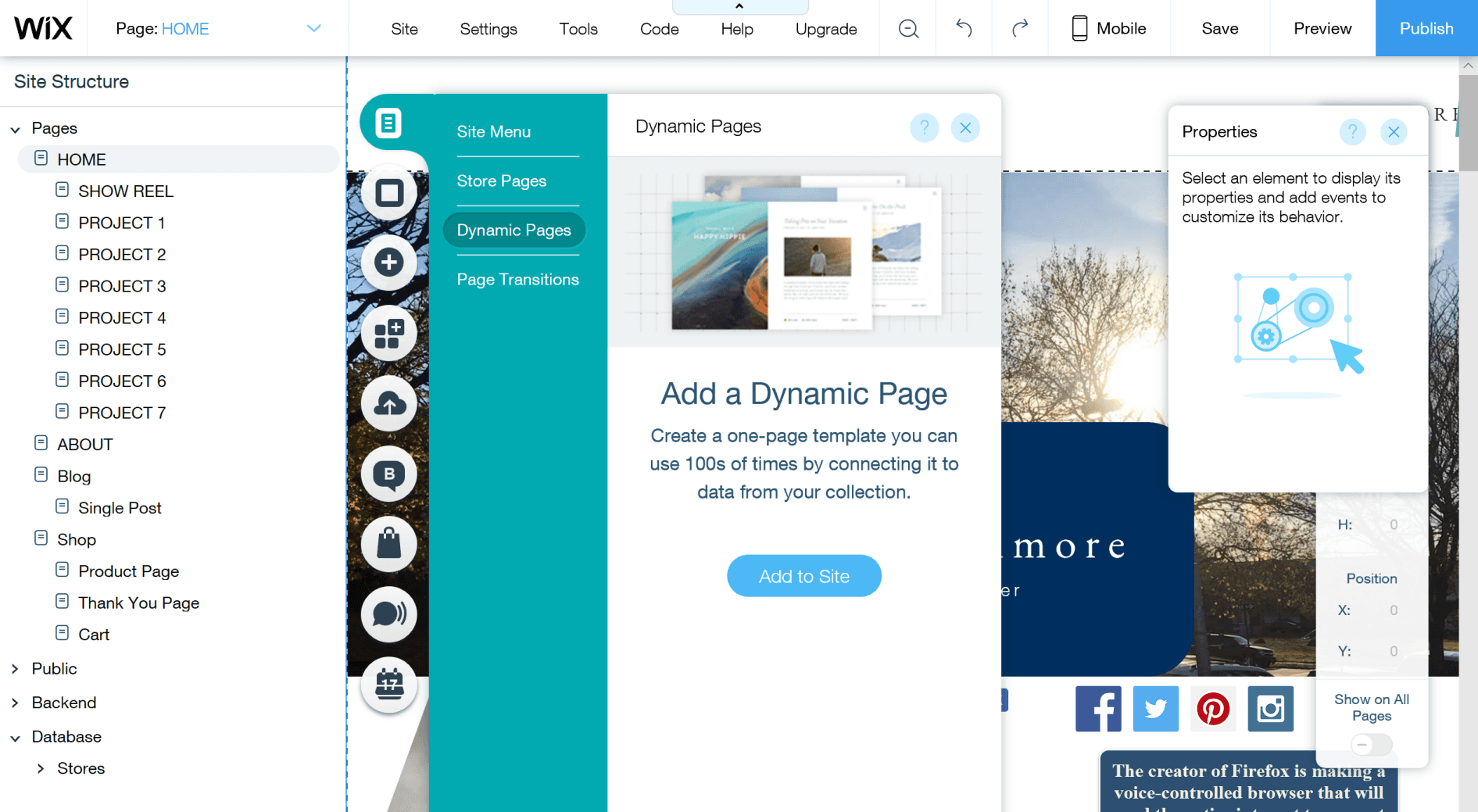
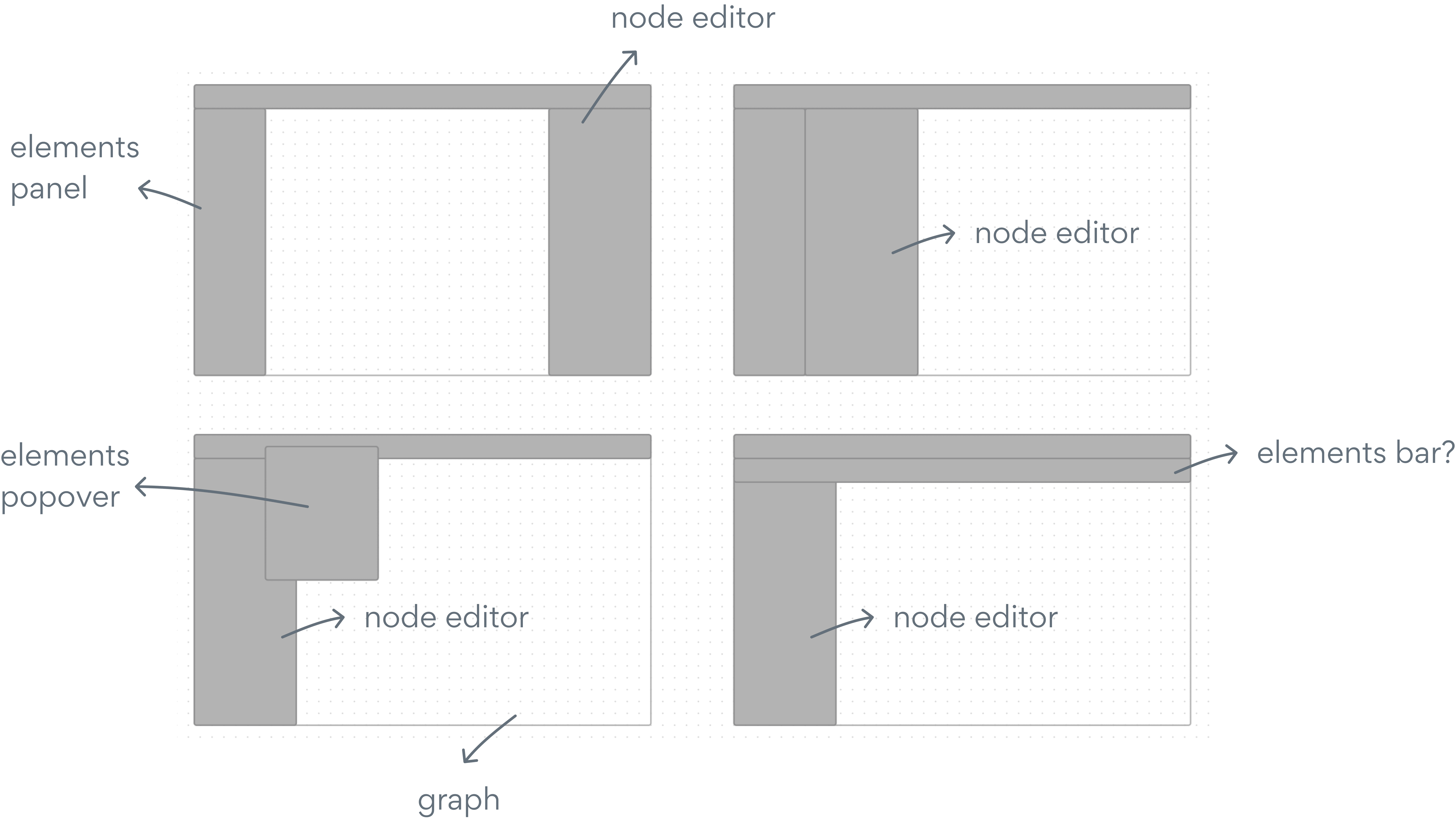
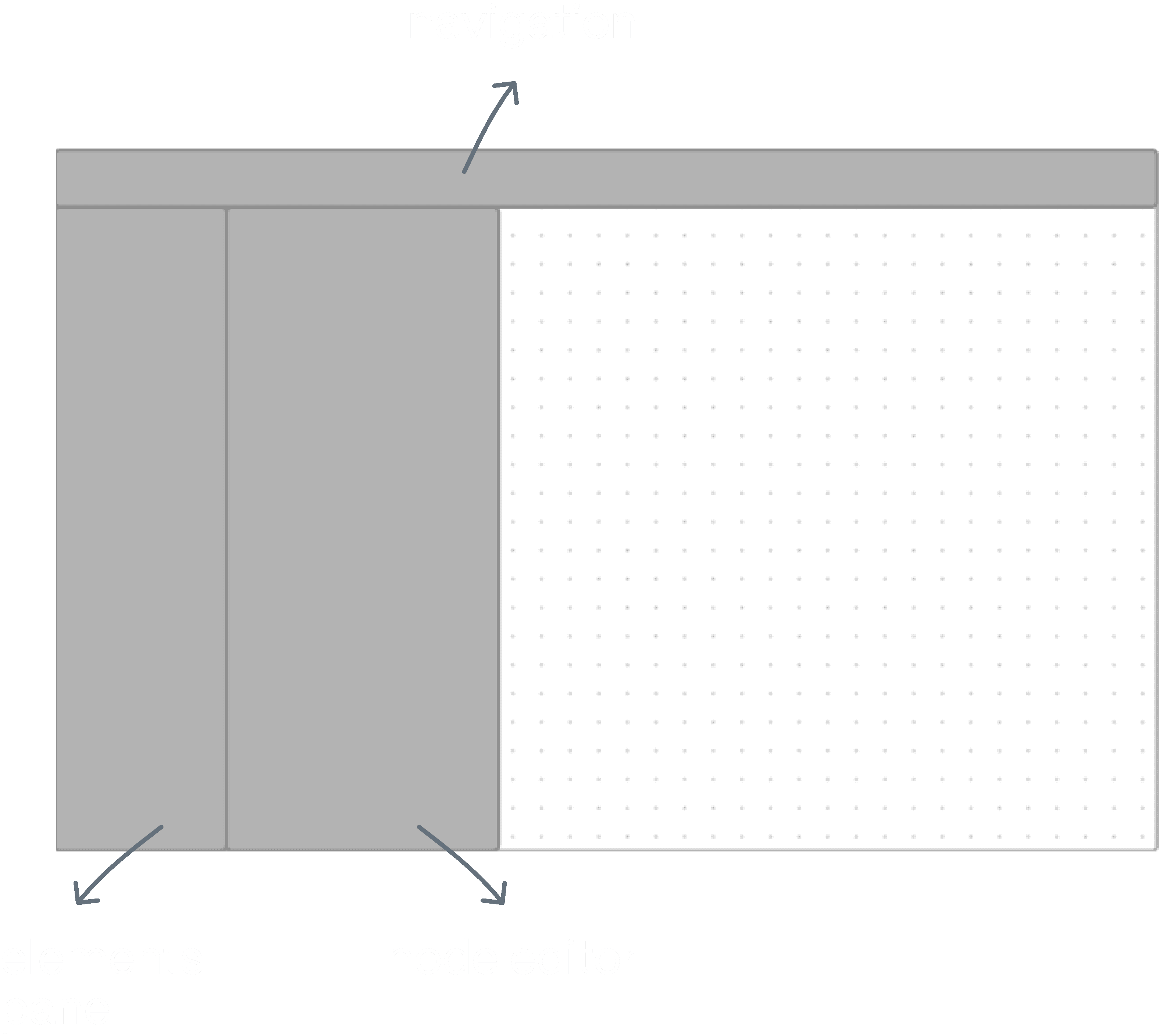
We conducted competitor and builder research to identify familiar patterns used by users. Our analysis included products like Airkit, Tonkean, Wix, and Framer.
We quickly identified common patterns, such as a left-hand elements panel, top navigation, right-hand panel for editing, and popovers for contextual editing. Additionally, we observed that graphs or visual artboards were consistently placed at the center with ample screen space for better viewing.
Wireframing
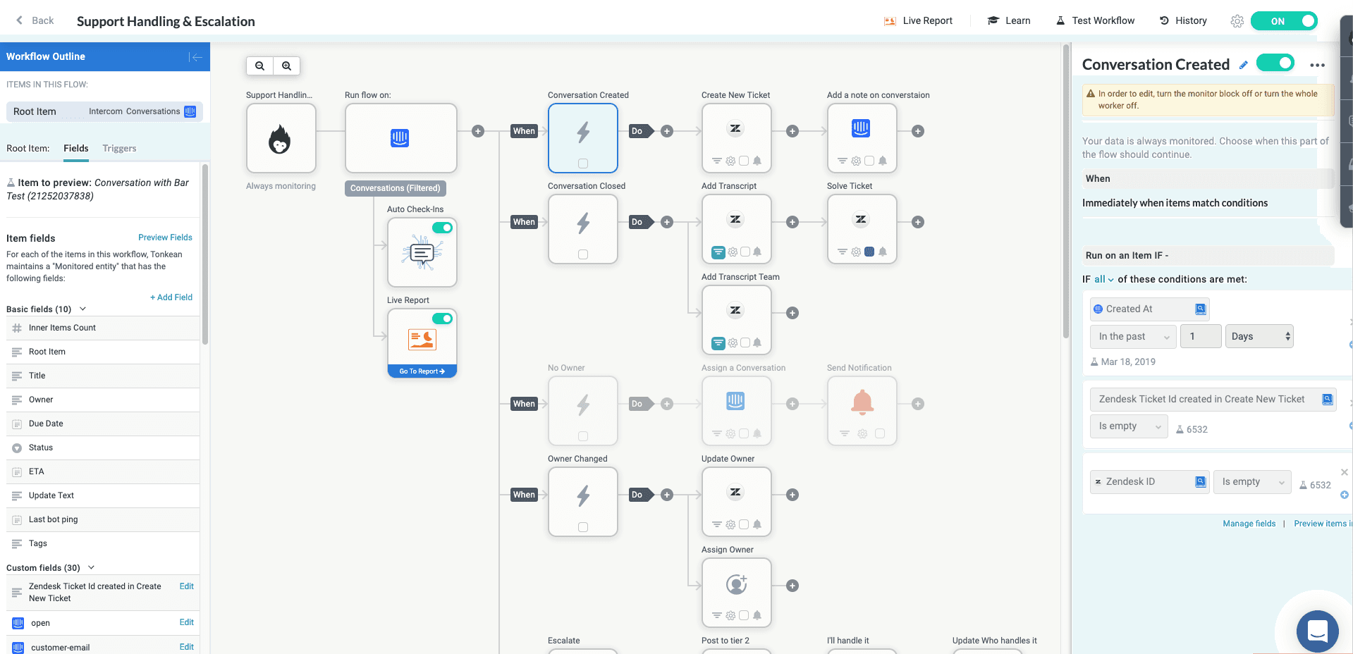
Builder navigation
How can we reduce the overwhelming feeling of being in a solution? Make it easier to navigate?
Introducing workflows to our interface was our way of doing so. Imagine workflows as distinct art boards or folders within your solution, enabling you to efficiently organize different parts of your flow based on use case. You can now divide it into a separate onboarding flow, main flow, satisfaction survey, and other workflows as needed.
This way, navigating the node graph and builder is smoother, and users can easily focus on specific aspects of their solution without feeling overwhelmed.
How can we empower users to interact with and use the builder?
While wireframing layouts, we had already compiled a list of features that we believed would be most suitable for the primary navigation. Some of these features encompassed errors, preview, publish, and project name. We focused on thinking more about where workflows would fit in as we continued wireframing.
We ended up tying workflows with the project name as they share the closest relationship.
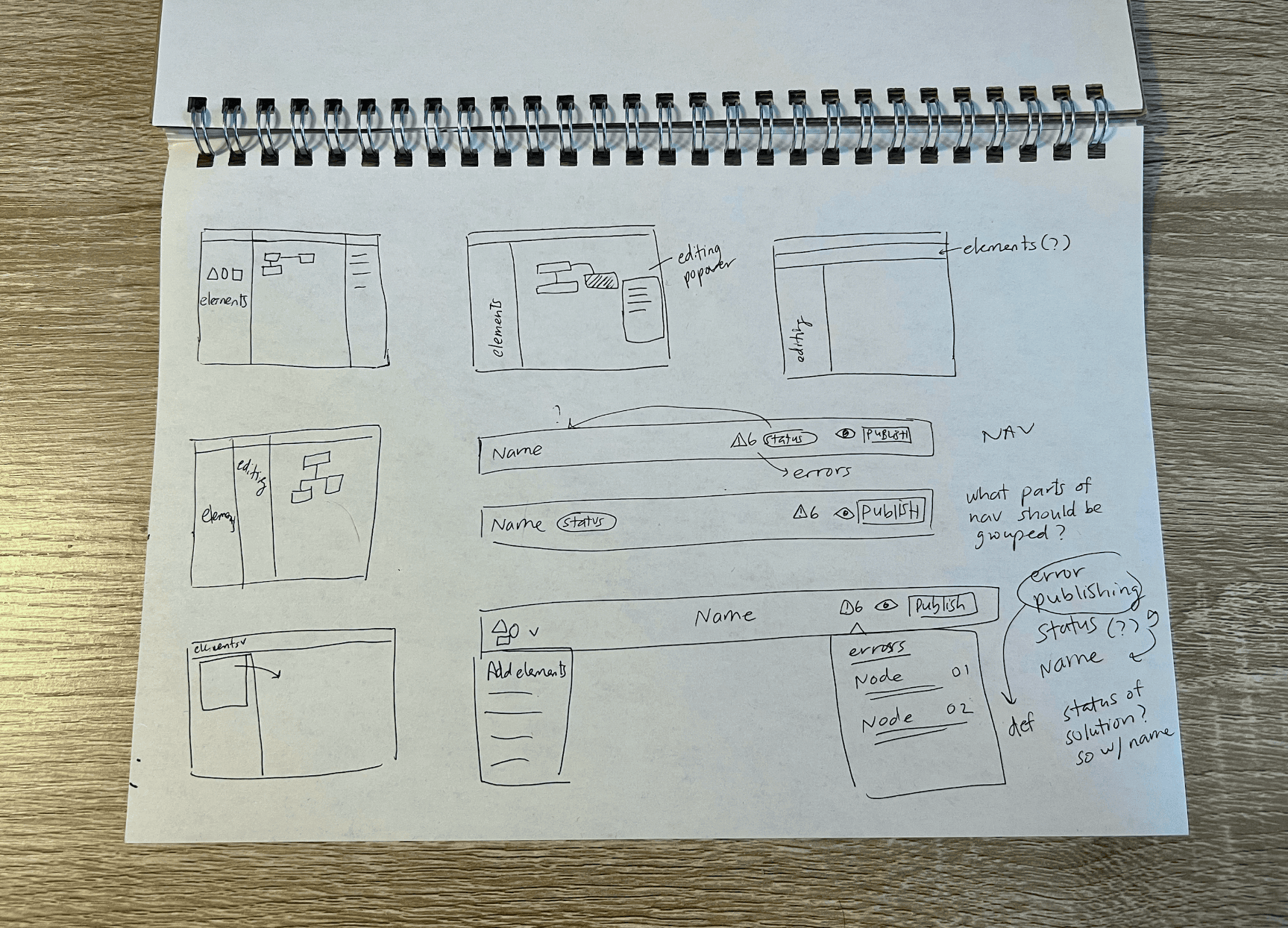
Additional considerations included a workflow dropdown to encourage navigation between workflows and an errors popover to show any outstanding errors or warnings in the solution. To make navigation accessible for non-technical users, we made sure to use casual language such as "draft" rather than "staging."
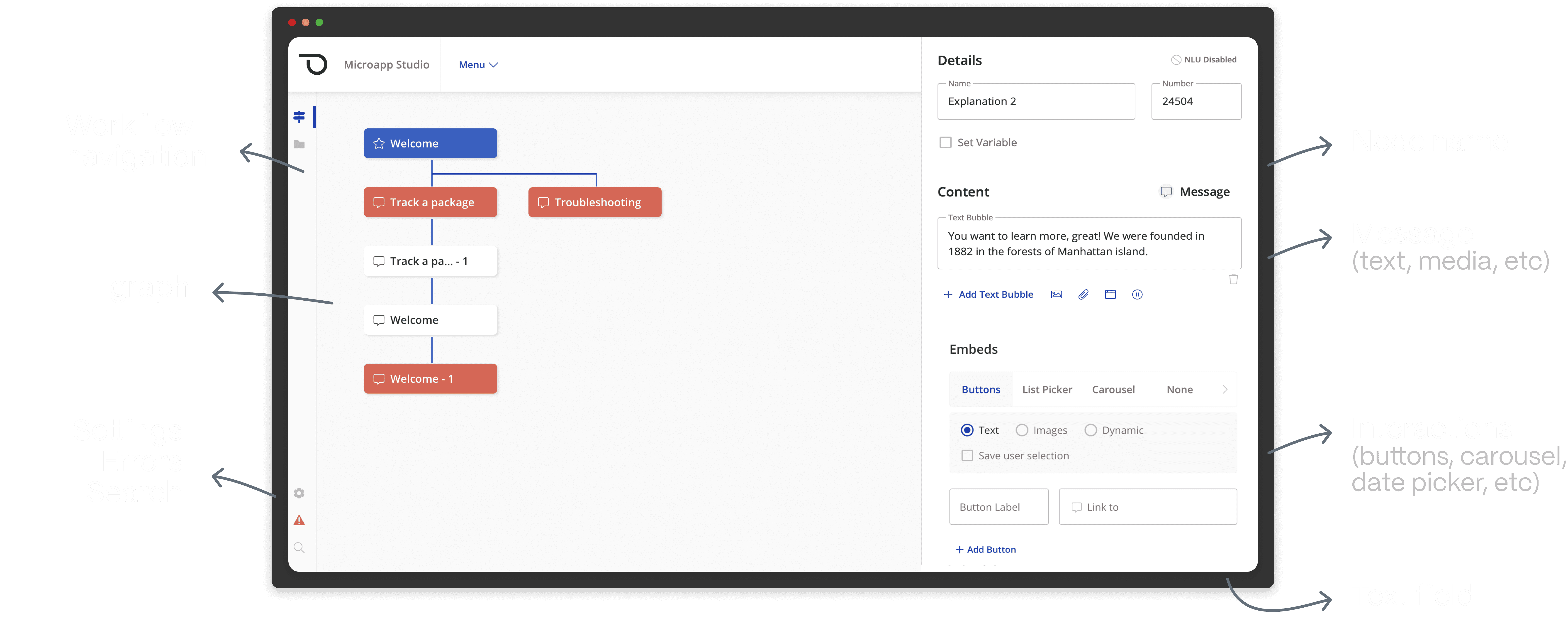
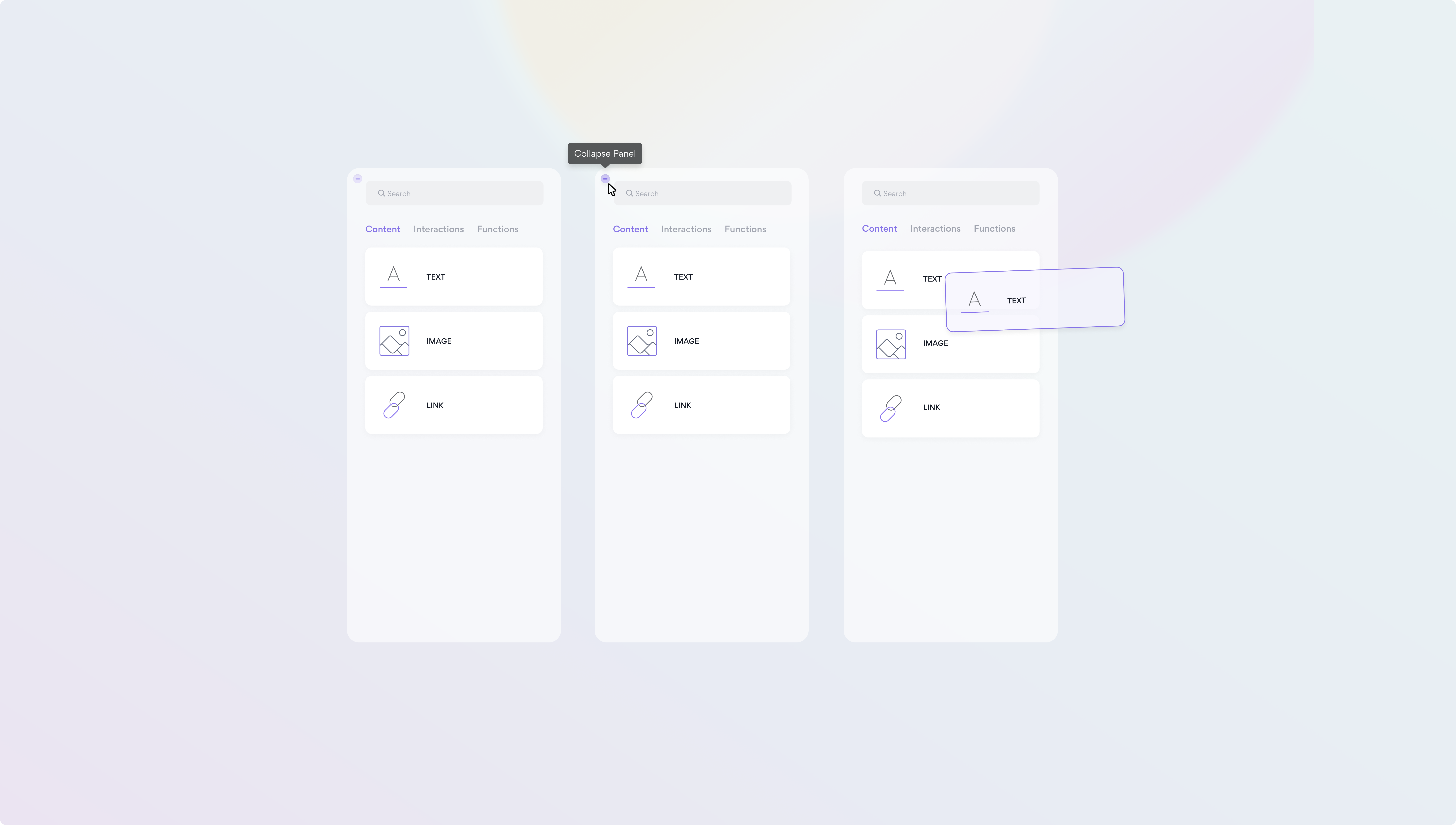
Elements Panel
Let's take a look at the previously determined layout…
In the early wireframing stage, we had settled on this layout, which seamlessly integrated with the overall user experience of our builder. Our next focus was exploring the design and interaction of the elements panel.
Goals for elements panel
Based on our current builder, we already had some needs figured out:
To hold 100s of elements that are the building blocks for nodes
Easily find what you're looking for (search)
The ability to drag and drop elements from this panel to the node editor
Wireframing
We did some quick wireframing and made sure to get inspiration from the builders we had taken a look at earlier.
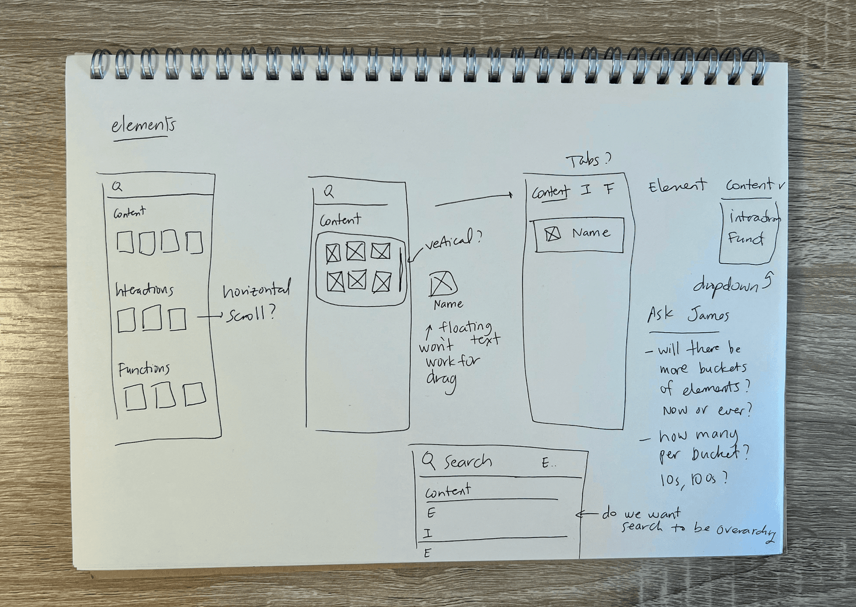
We quickly arrived at a straightforward panel design featuring three tabs, each representing different types of elements that can exist: Content, Interactions, and Functions. To ensure user-friendliness for non-technical users, we followed common drag and drop patterns used in builders like Wix and Squarespace while designing the interactions for the element cards. Additionally, we included a search bar for seamless navigation..
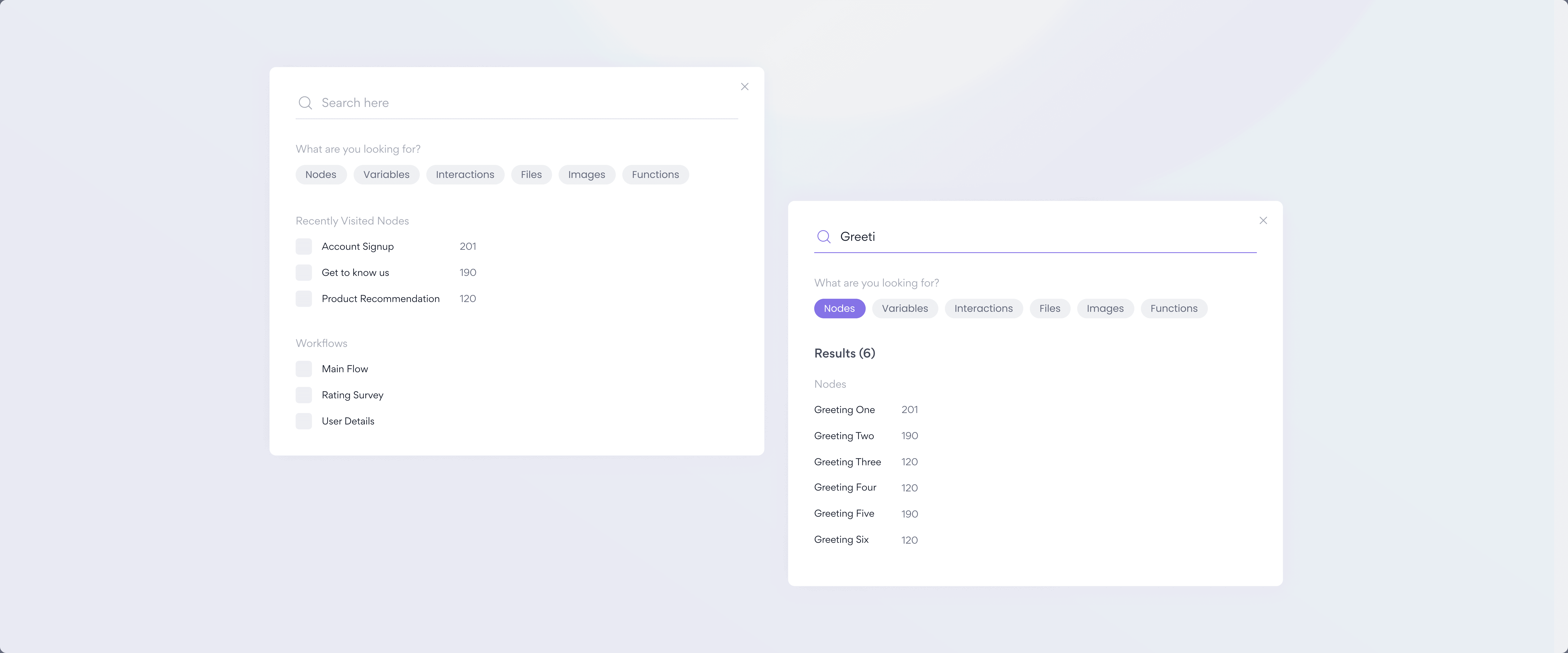
Search
Our focus was to design a reusable search experience that is not only useful but also highly contextual.
To begin, we conducted informal interviews with CX managers to gather insights into their frequent search queries, the type of metadata they find useful, and the specific insights they seek during the searching process.
Goals for search
Based on our conversations, we set some goals for this feature. We wanted search to be able to:
Navigate to nodes, variables, and functions based on search results
Surface frequently accessed areas of the solution
Navigate to other workflows
Filtering based on search intentions
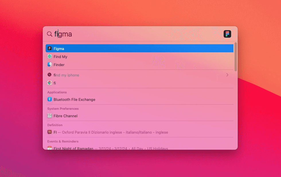
I started with taking a look at one of my favorite search experiences Spotlight Search and thinking about what makes it so good.
The sections clearly show it's searching across multiple apps, I love that I can access it anytime with a command, and it's just seamless.
Wireframing
We moved forward with wireframing keeping in mind the goals we had gathered from research, as well as the pros of Spotlight Search.
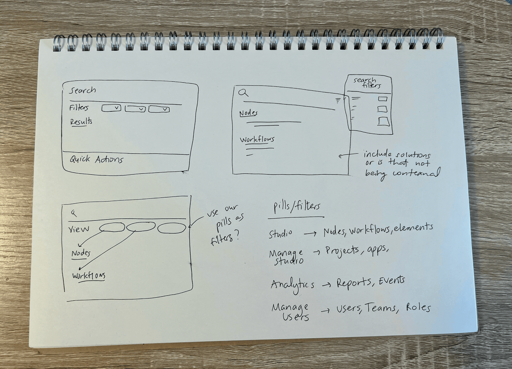
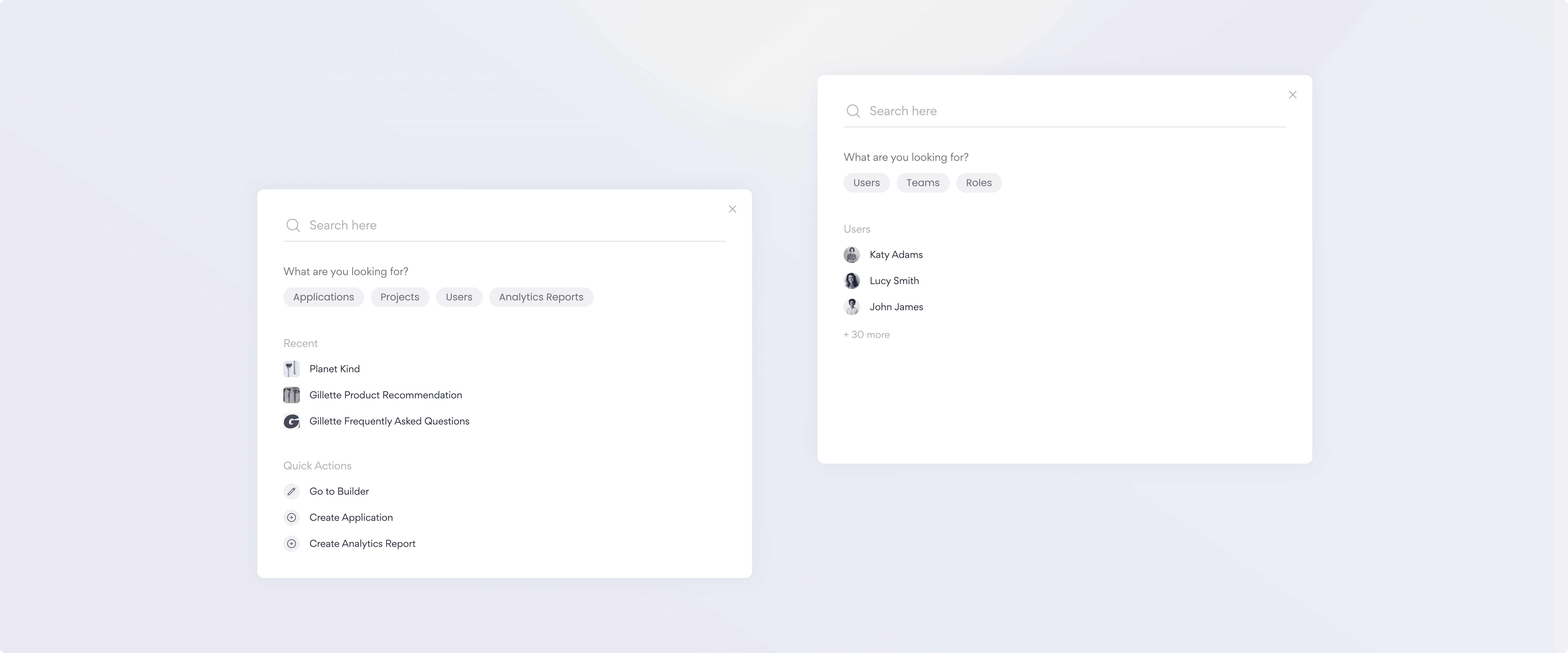
After several iterations, we decided to utilize our existing pill component as filters directly under the search input. This enables users to quickly choose their desired criteria for refining the search results. Additionally, we incorporated quick actions, like recently visited sections of the solution and other workflows.
Considering that this search experience is expected to be a significant part of non-technical users' interactions, our aim was to design it to be both straightforward and comprehensive.
Further considerations
While designing this search feature, I took into consideration its potential extension to our other products. By making the filters easily replaceable, we can adapt them based on the specific user search needs across different products. Similarly, the quick actions sections can be tailored to be more relevant to users as they navigate through other products, such as Analytics.
This approach aims to create a seamless and consistent search experience across our product ecosystem.
Testing + measuring impact
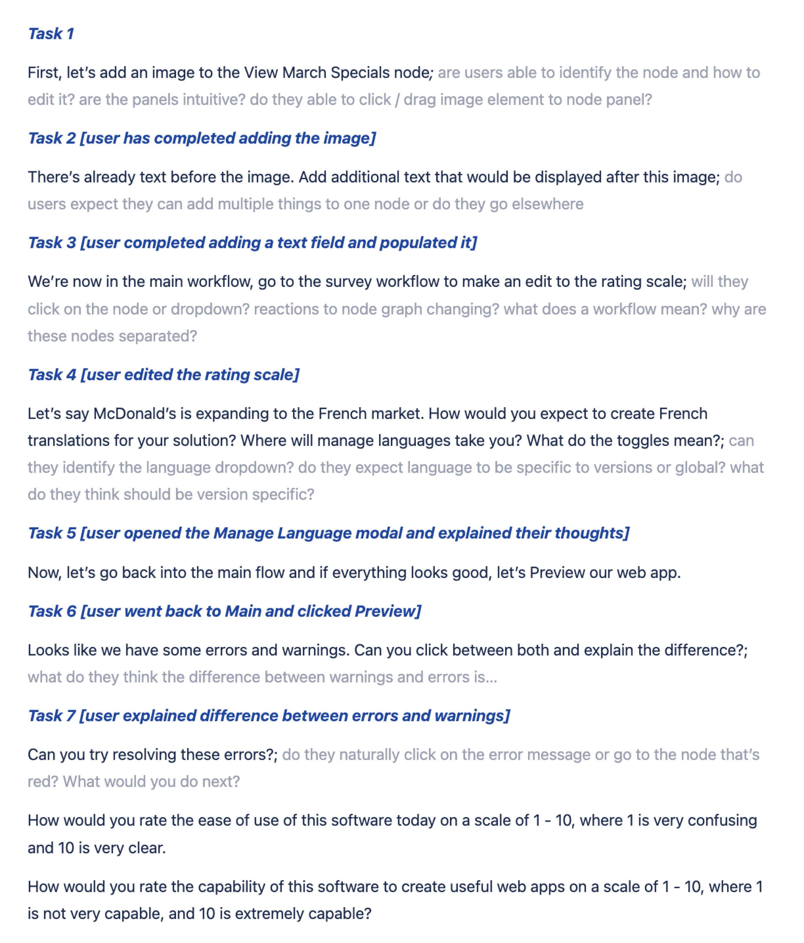
I conducted testing regarding the interface layout and navigation with 10+ non-technical users through UserZoomGo.
During testing, I presented users with a prototype of the completed designs and guided them through various tasks, such as navigating between nodes, workflows, errors, and using the search function. Throughout the study, we made sure to collect CSTAT scores to gauge user satisfaction and overall experience.
All users we tested rated the experience above 8.5/10
Despite having no technical background, they were able to navigate through the tasks with little to no problems. In fact, they sped through the tasks much faster than we had anticipated.
Next steps…
Figuring out what the node editor panel looks and feels like
With the basic layout and functionality of the interface established, it is now time to focus on the next chunk of the work, which revolves around the node editor. In this editor, users will have the ability to add and edit elements such as text, images, carousels, and even incorporate functions like routing.
Continued research and testing…
I also hope to continue ongoing testing of the prototype as it evolves and becomes more comprehensive.